HOOVER ELEMENTARY
BAY AREA CHAPTER — Oakland, CA
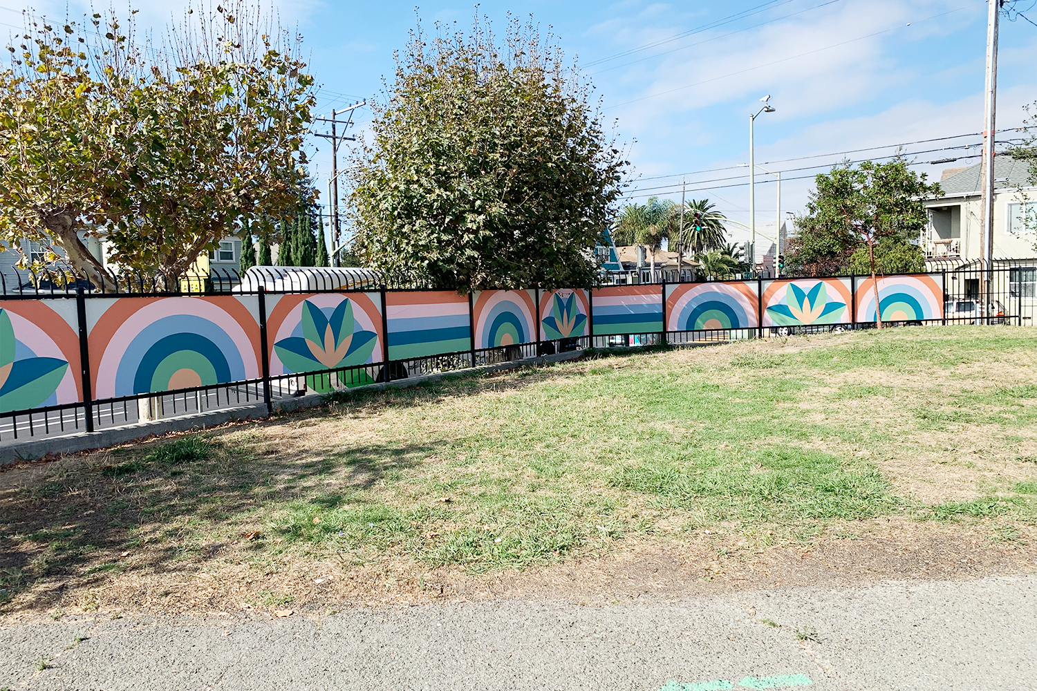
Hoover Elementary, Phase 1
Hoover Elementary, Phase 2
Big Picture
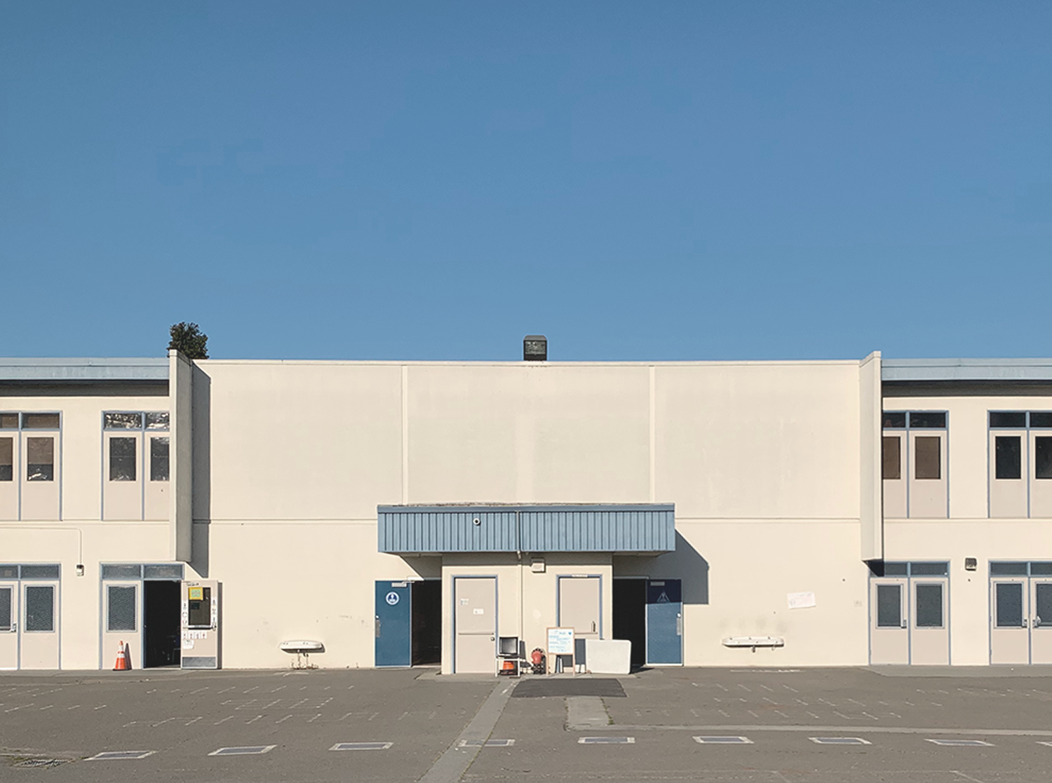
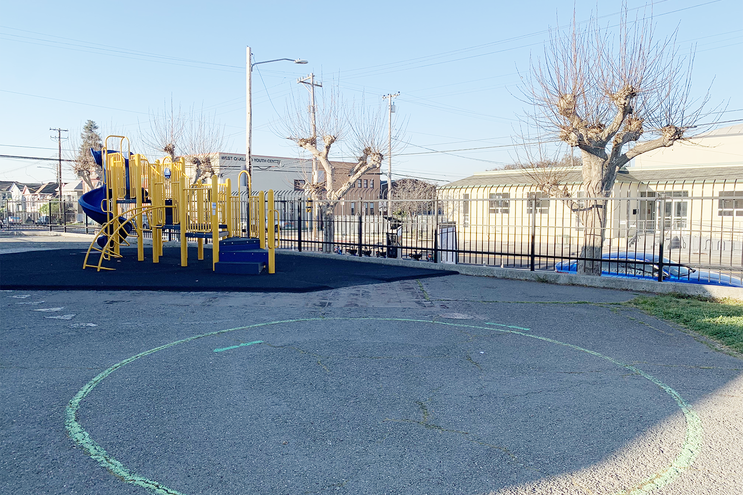
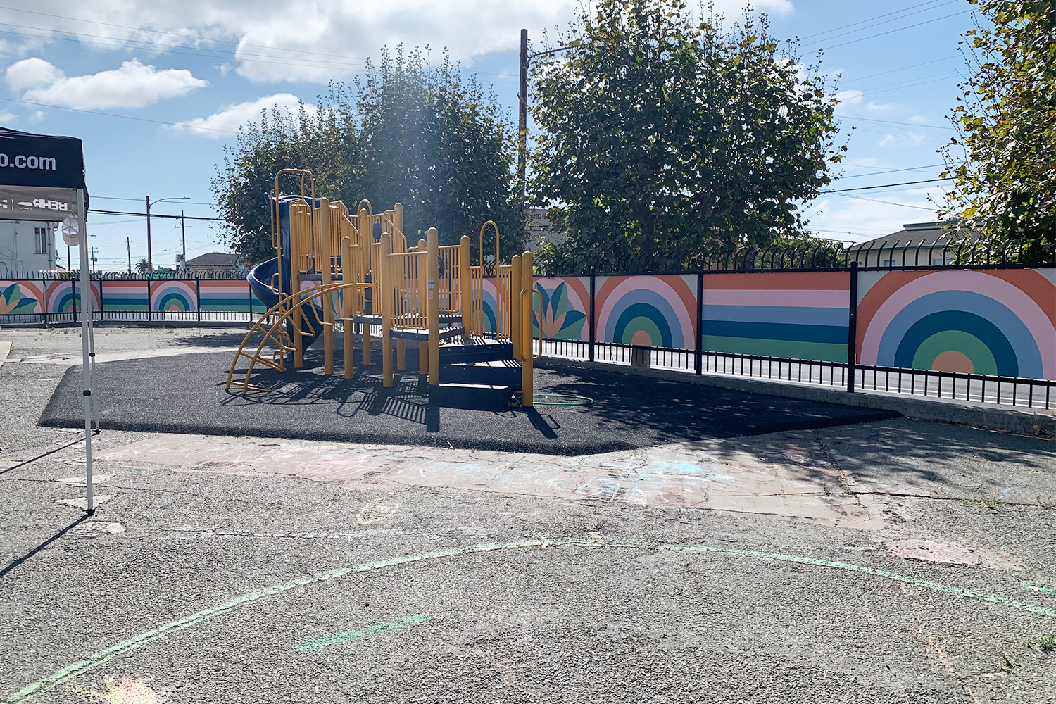
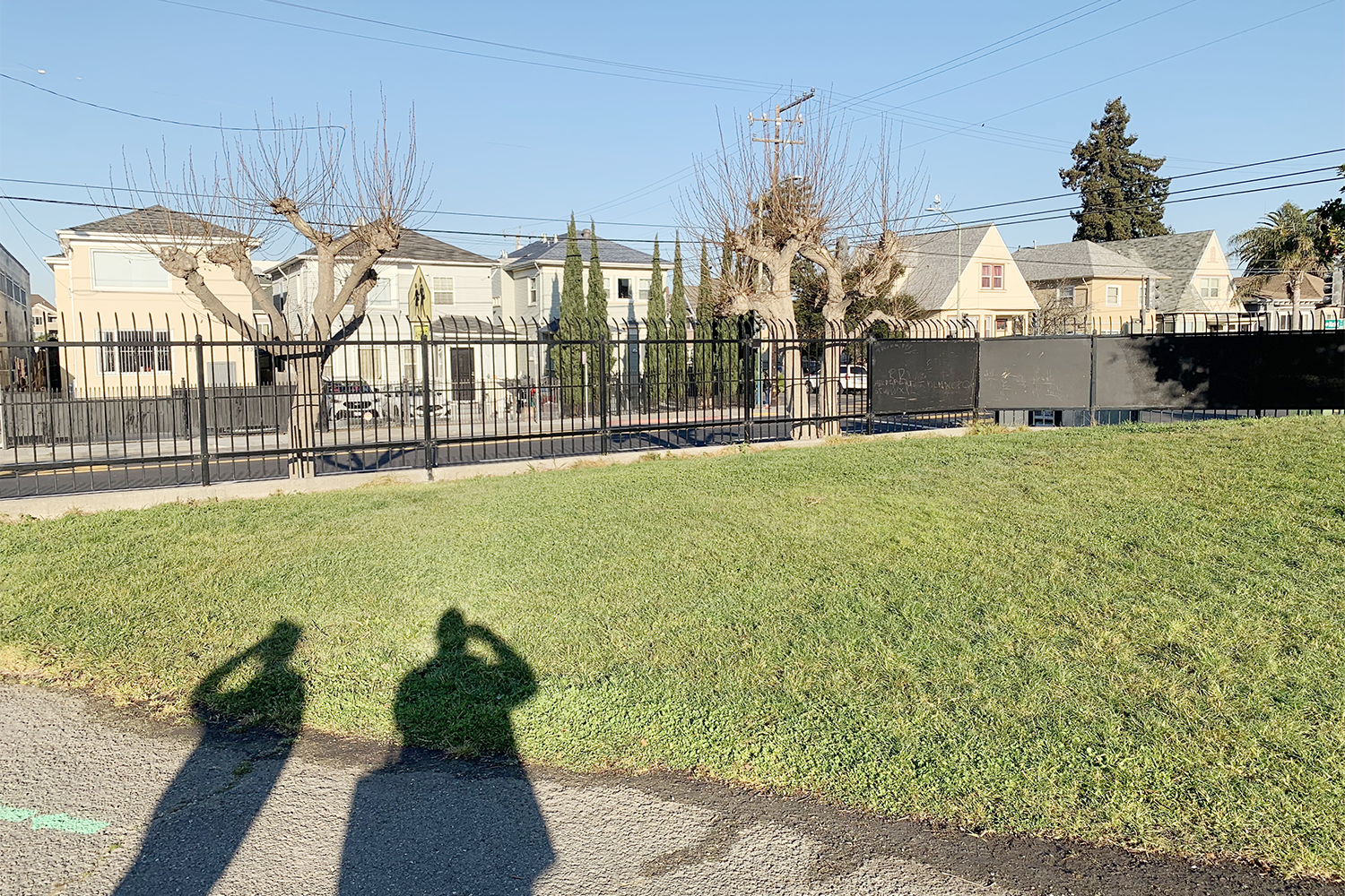
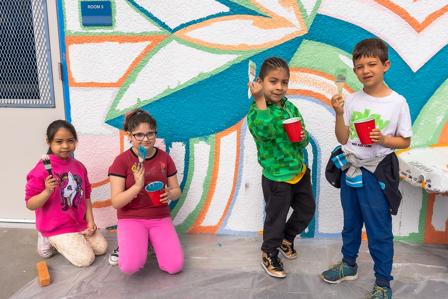
A full city-block campus of beige buildings were void of personality at Hoover Elementary. The buildings provided education, shelter, and protection, but did not match the rich, dynamic presence with which the students filled them. A series of murals across the campus now bring energy and identity to the campus.
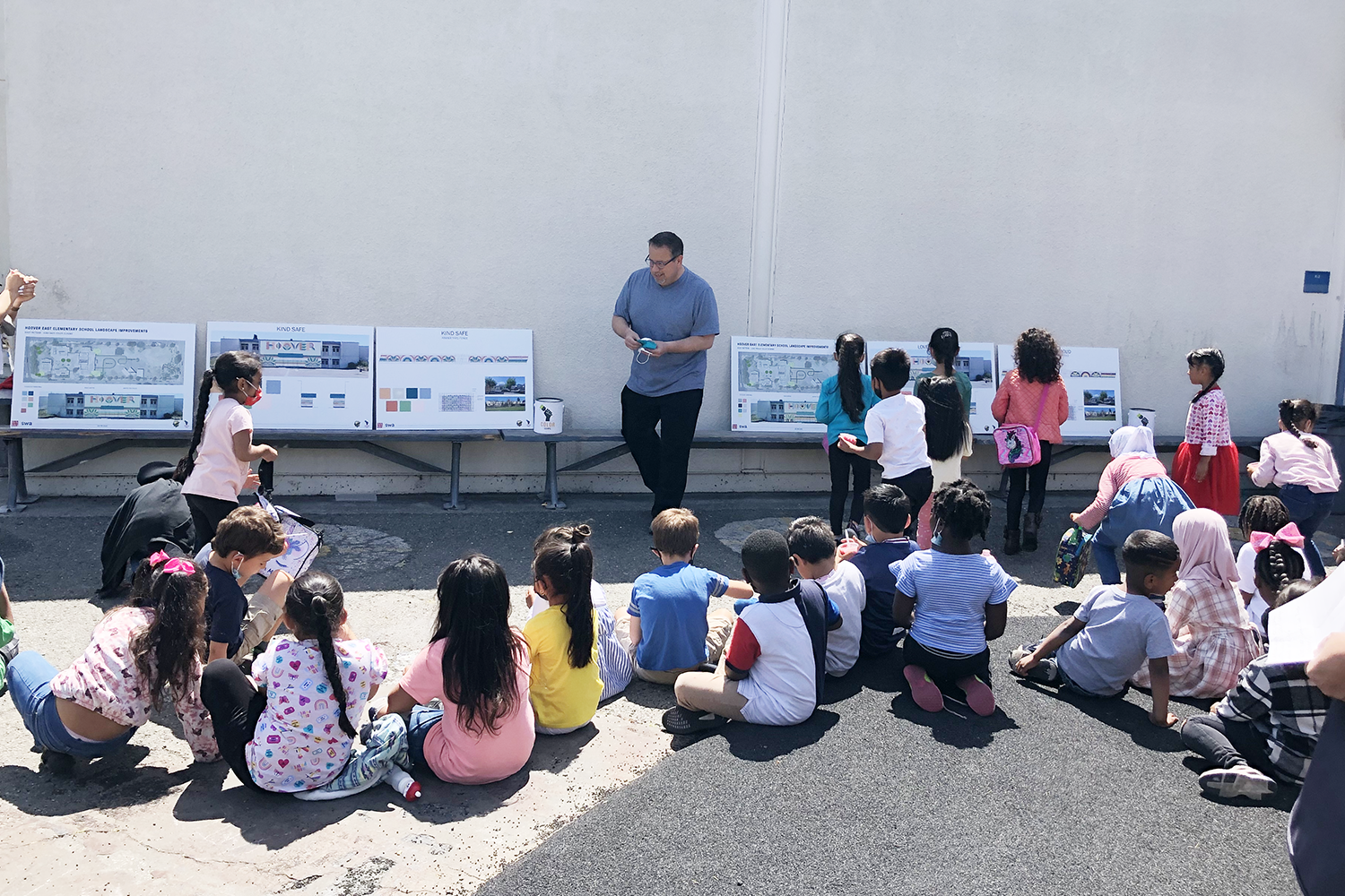
A Conversation About Color
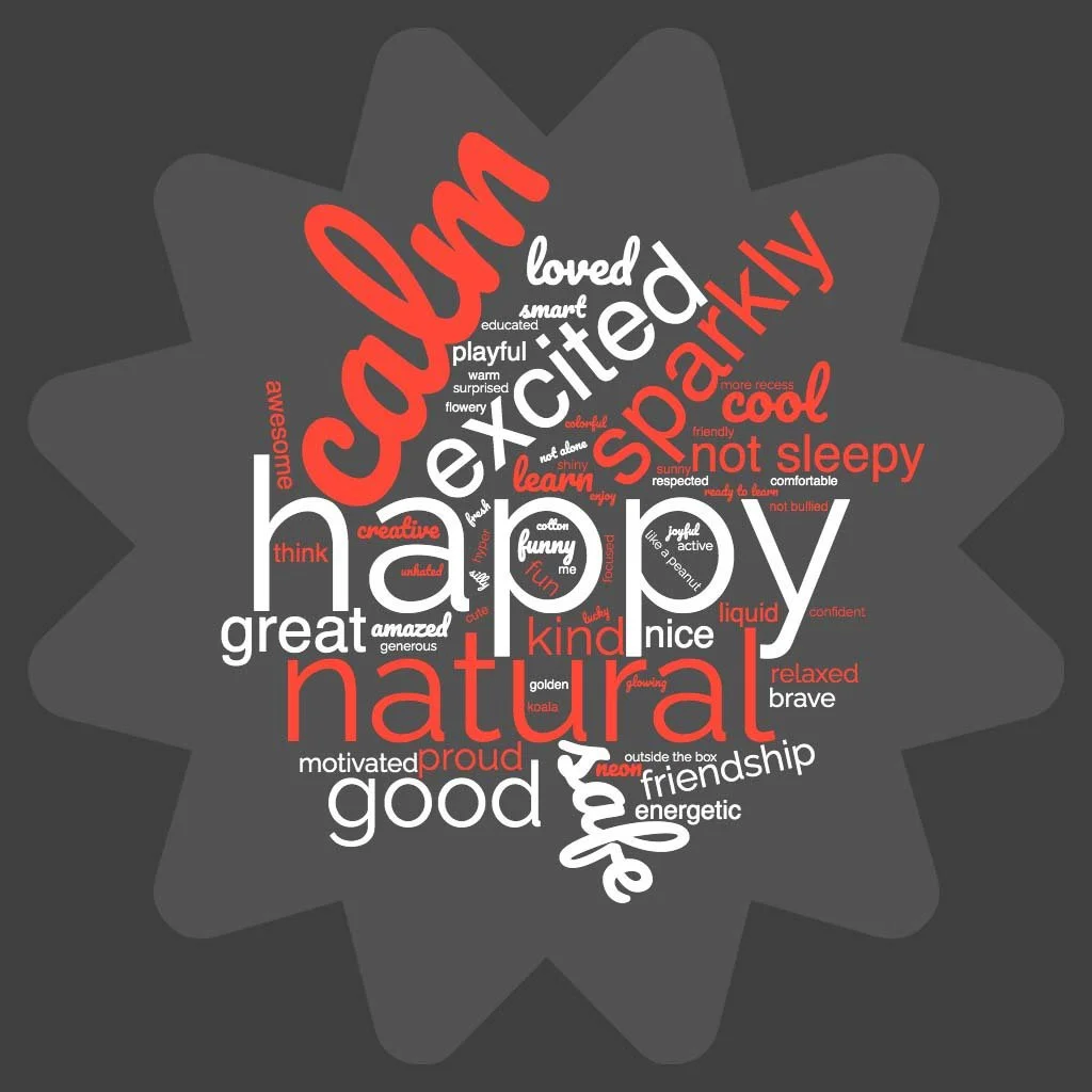
Laura Guido-Clark led the students through a color seminar to demonstrate how different colors make us feel different things. The students responded with enthusiasm, sharing their stories of how color has impacted their lives. Several special moments stood out when students recognized how the cultural and racial diversity of their school is like a beautiful, colorful piece of art.
A recurring theme began to appear the more we spoke with the students. When asked how they want to feel when they are at school, safe and proud were among the top responses. It was clear that Hoover was more than just a place for learning; it is their home away from home, their peace and security, the root of all their dreams and goals.
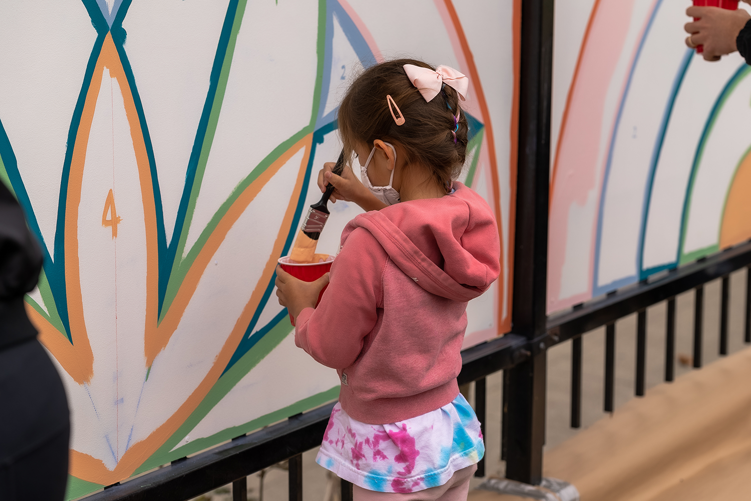
Over the course of planning the project, students regularly expressed disbelief that Project Color Corps was doing this for them. One little guy said, “When you make our school look like this, I won’t ever want to leave.” How students responded to the fact that we were there to do something for them was moving. And that we were leaving them with these beautiful works of art seemed beyond belief to many.

The Transformation
BAMO and SWA were inspired by the oak groves that once covered Oakland. Mighty oak trees form the basis of the design, with rainbows and streams around. Large leaves emblazon the main school building, fostering a sense of pride over the playground and neighborhood.
Students were asked to vote for their preferred color palette: LOVE PROUD, with colors that express strength and joy, or KIND SAFE, with colors that express caring and security. It was a close vote, but in the end, KIND SAFE was the winning scheme. Students said it made them feel wonderful and cheerful, relaxed and safe, calm and comfortable. One student saw the ocean in this scheme, while another saw Candy Land.
Our embrace of color seems to fade as we grow older. It is unwise to dismiss the power of color, as the students reminded us when they said, “This makes me feel not lonely,” “This makes me believe in myself,” and “This makes me want to do good.
PHASE 1: Kinder Yard


PHASE 2: School Building


SPECIAL THANKS
A tremendous thank you to our partners who made this project a reality:
CHAPTER: BAY AREA
SPONSORS:
VIDEOGRAPHER/
PHOTOGRAPHER:
JL Productions
PROJECT MANAGER:
Tim Haggerty
MURALIST: